Every page, end to end. Fourteen captures, no filler.
The store is private, so this is the walkthrough. Real captures from the shipped site, each with the decision behind it.
Landing
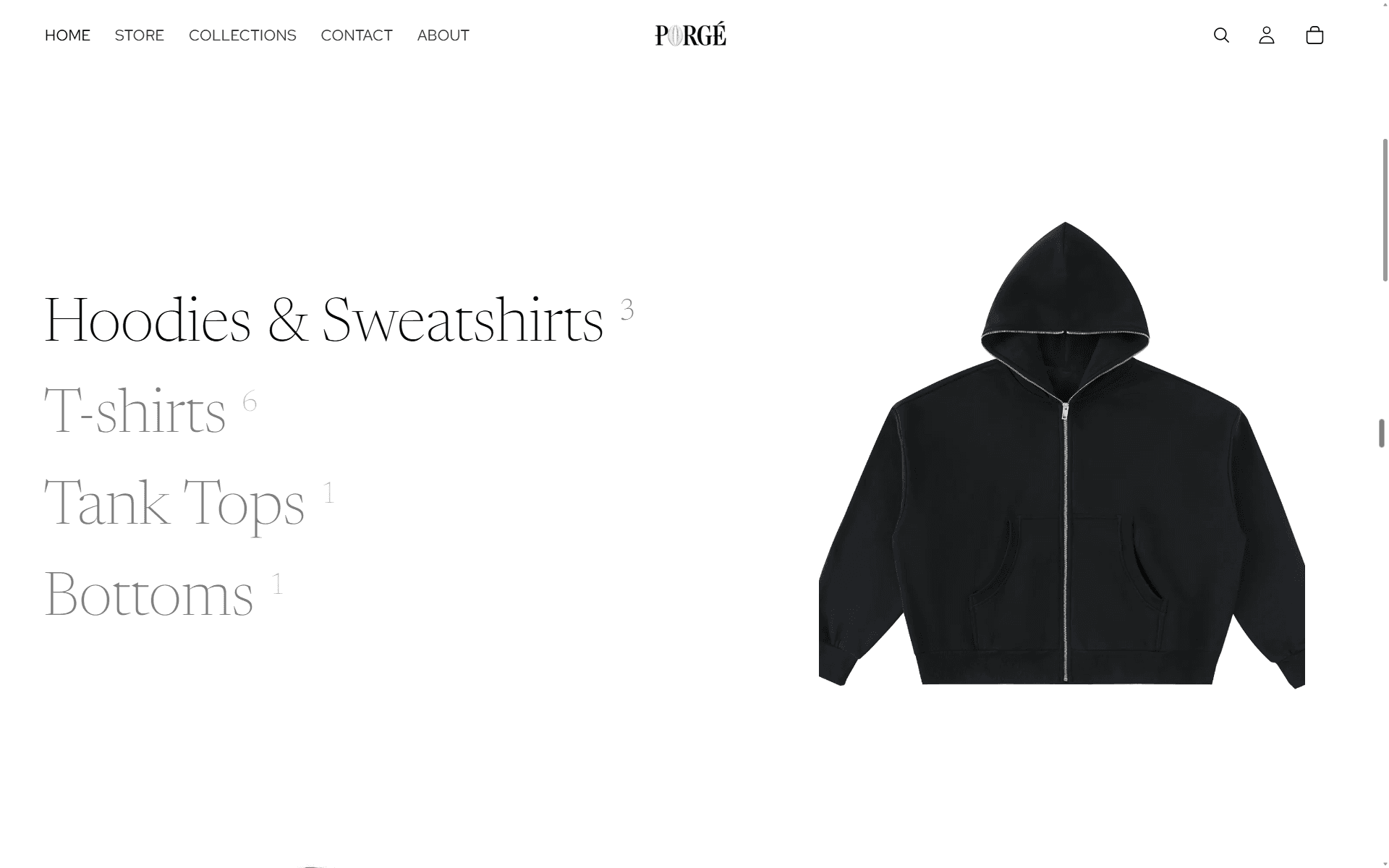
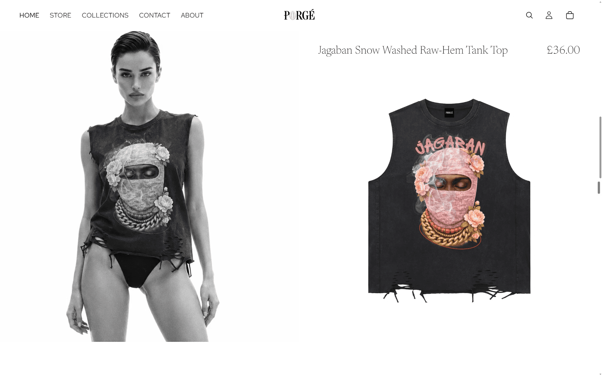
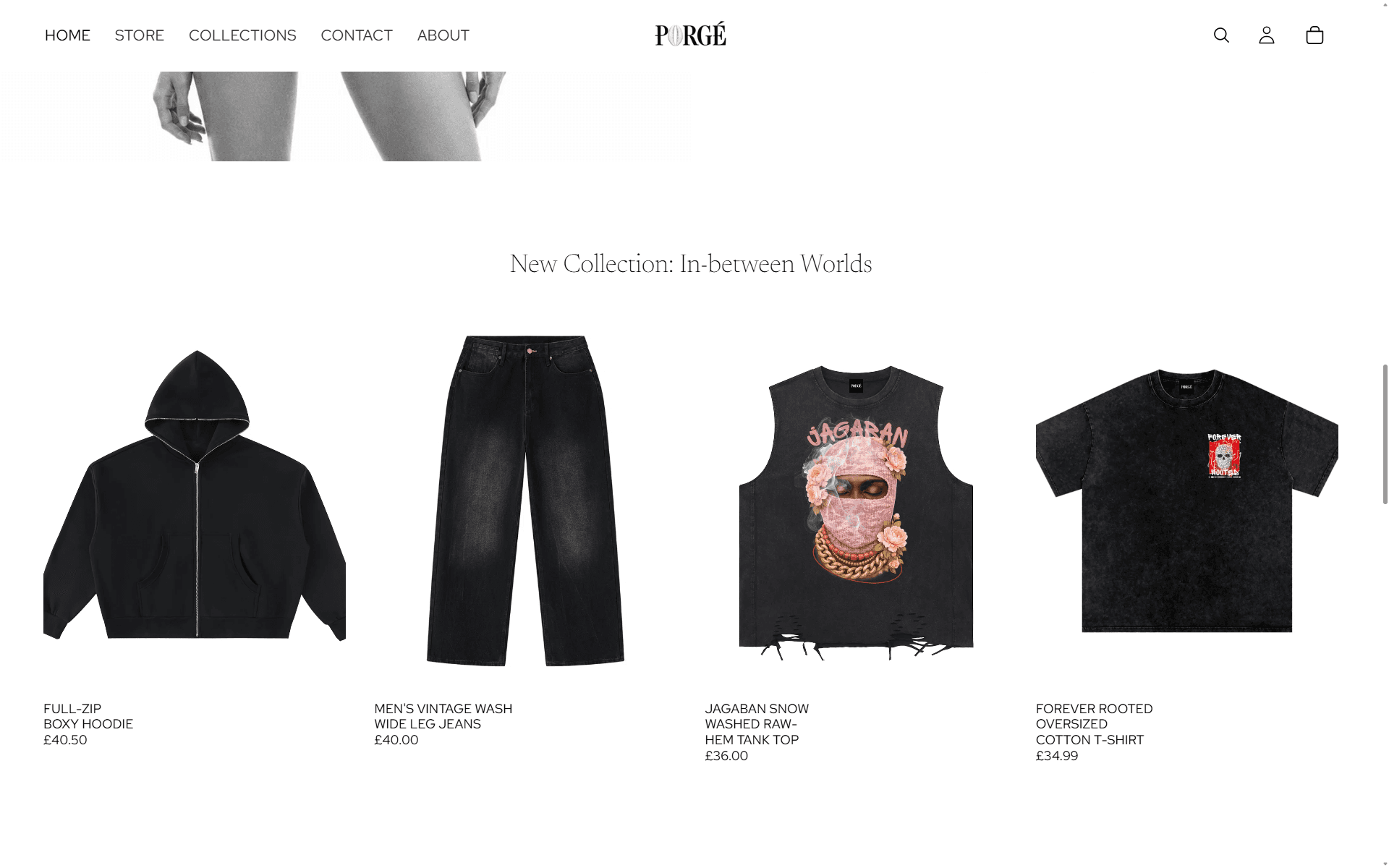
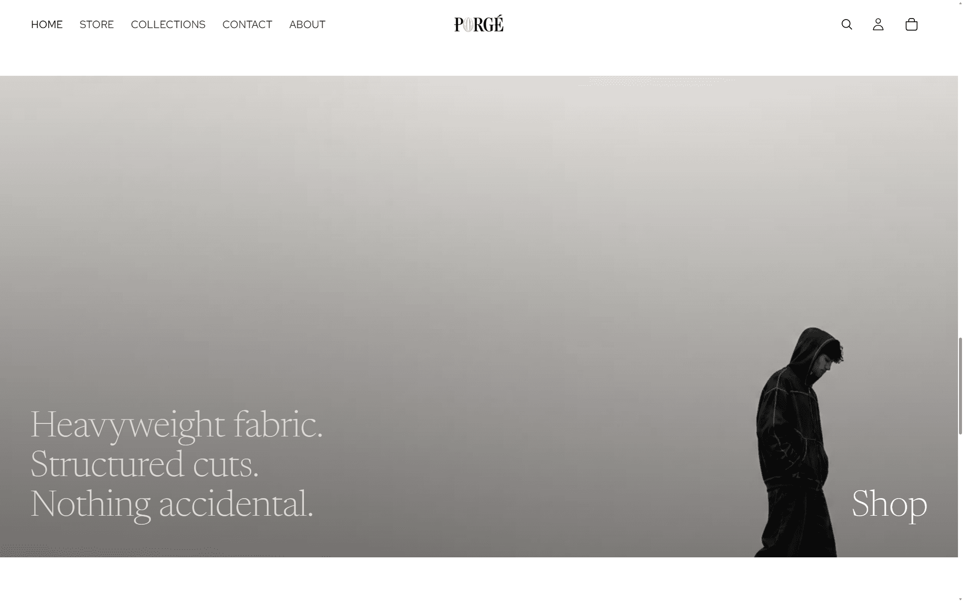
The scroll as designed: split hero, categories exhale, campaign moments, the heavyweight banner, quiet footer.
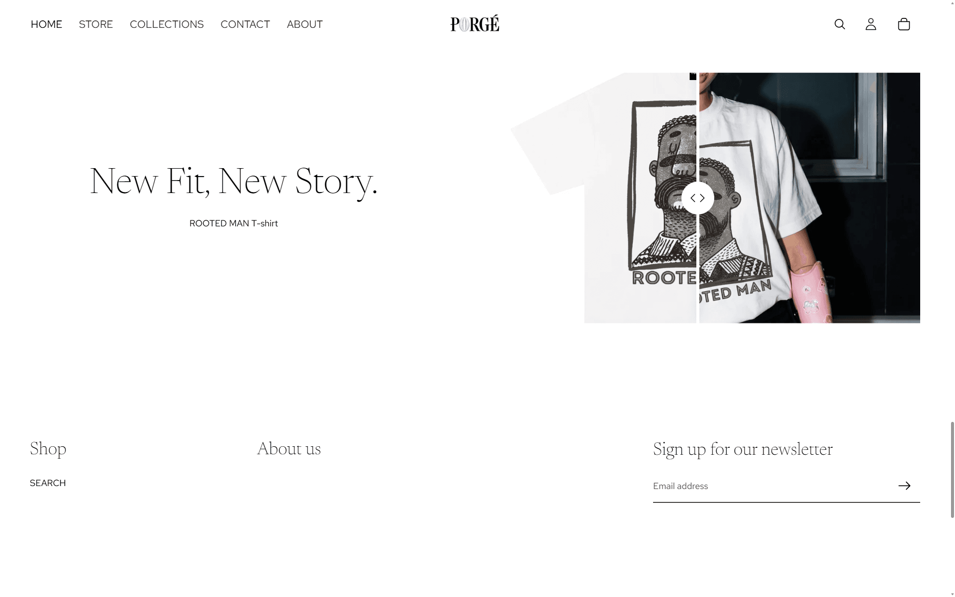
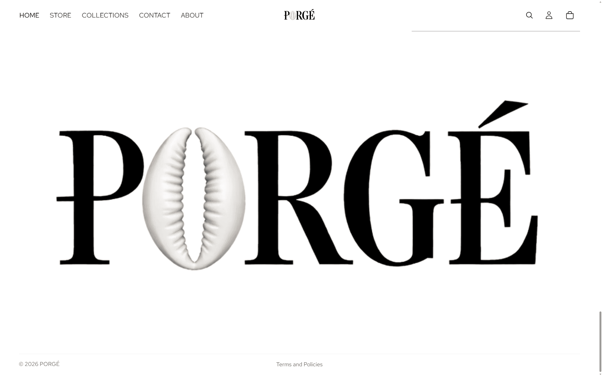
The hero. Two photographs, one seam, the wordmark on the split.Categories, the intentional breather. Negative space, serif lines, one contrasting product each.Tank top showcase. The Las Vegas shot treated as campaign, not catalogue.Collection moment. Full-bleed imagery, copy kept to a whisper.The heavyweight banner. Figure bottom-right, walking toward the Shop link.Rooted Man slider. The graphic tee given a gallery, not a grid cell.Footer. Email capture, hairline borders, nothing shouting.
Store
Commerce pages: the archive, the product grid, and the paths between them.
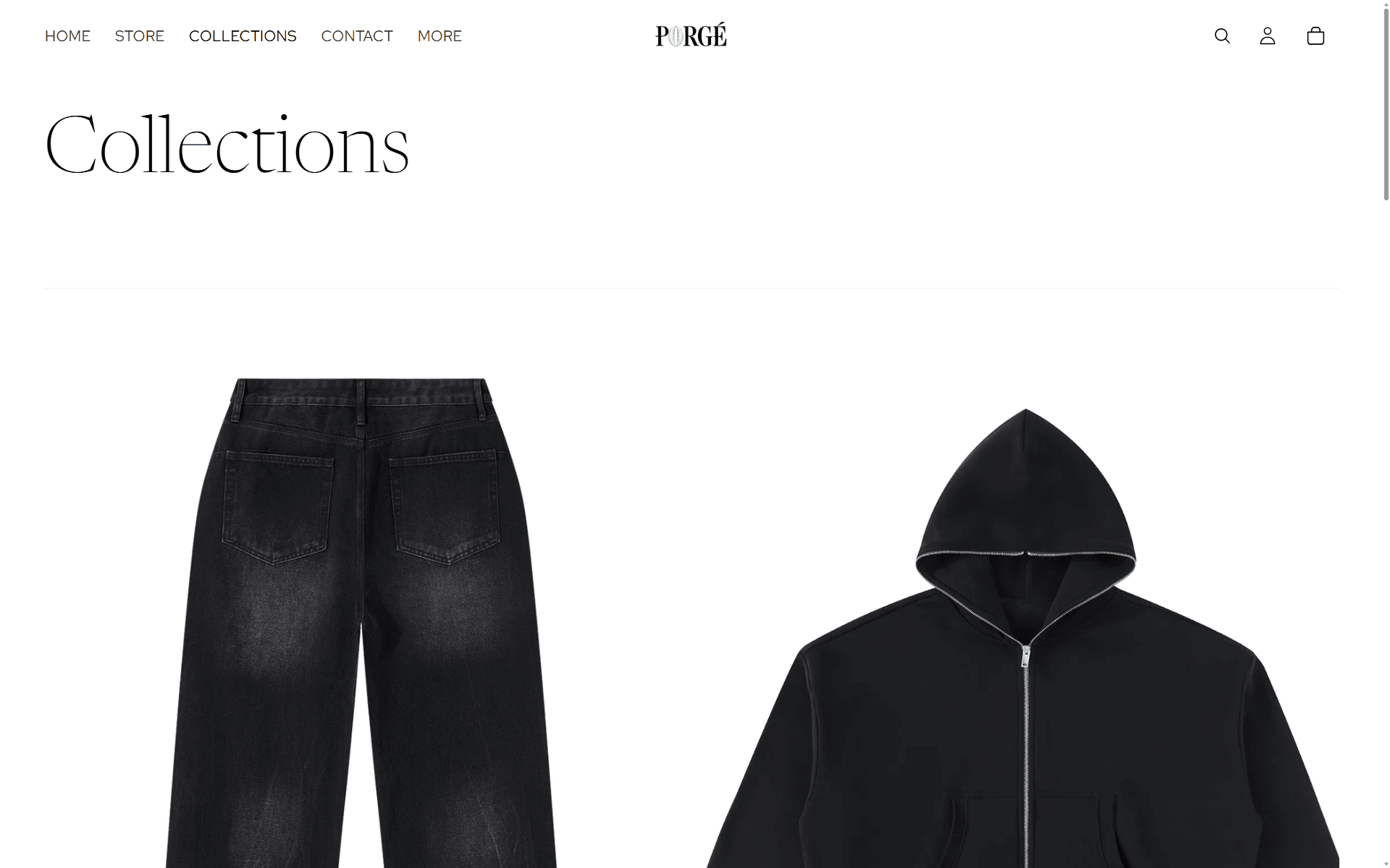
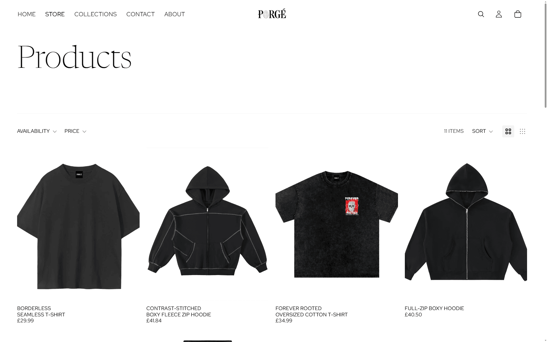
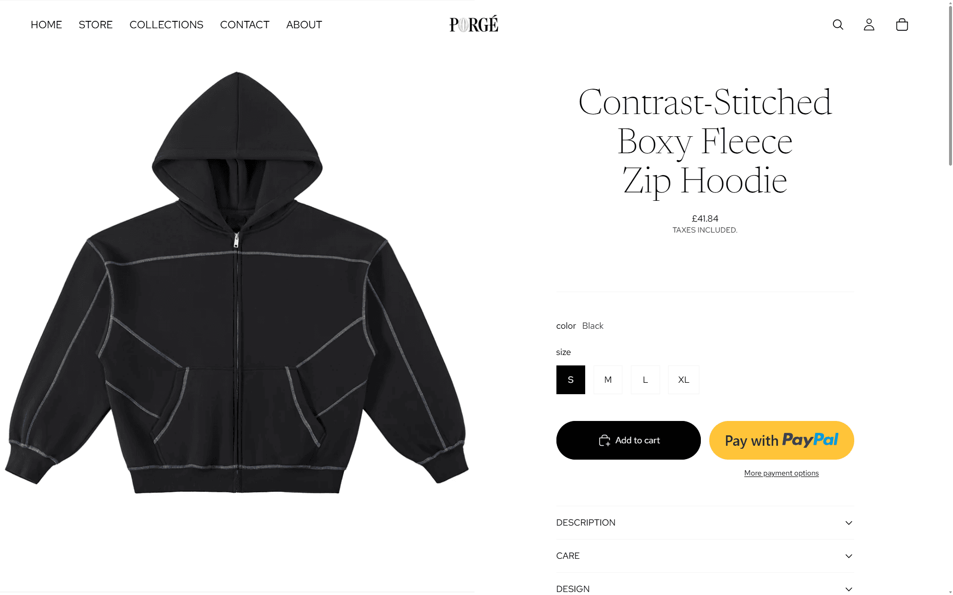
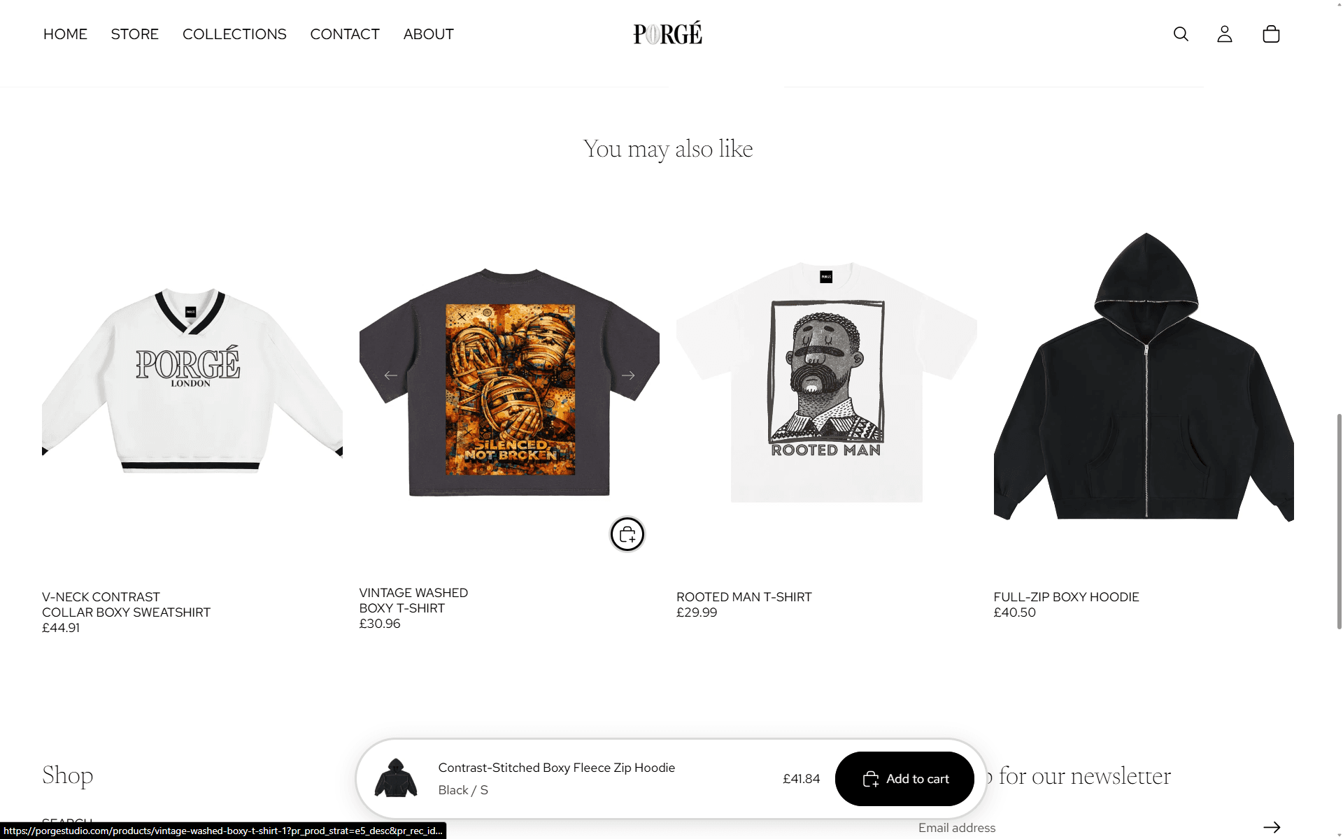
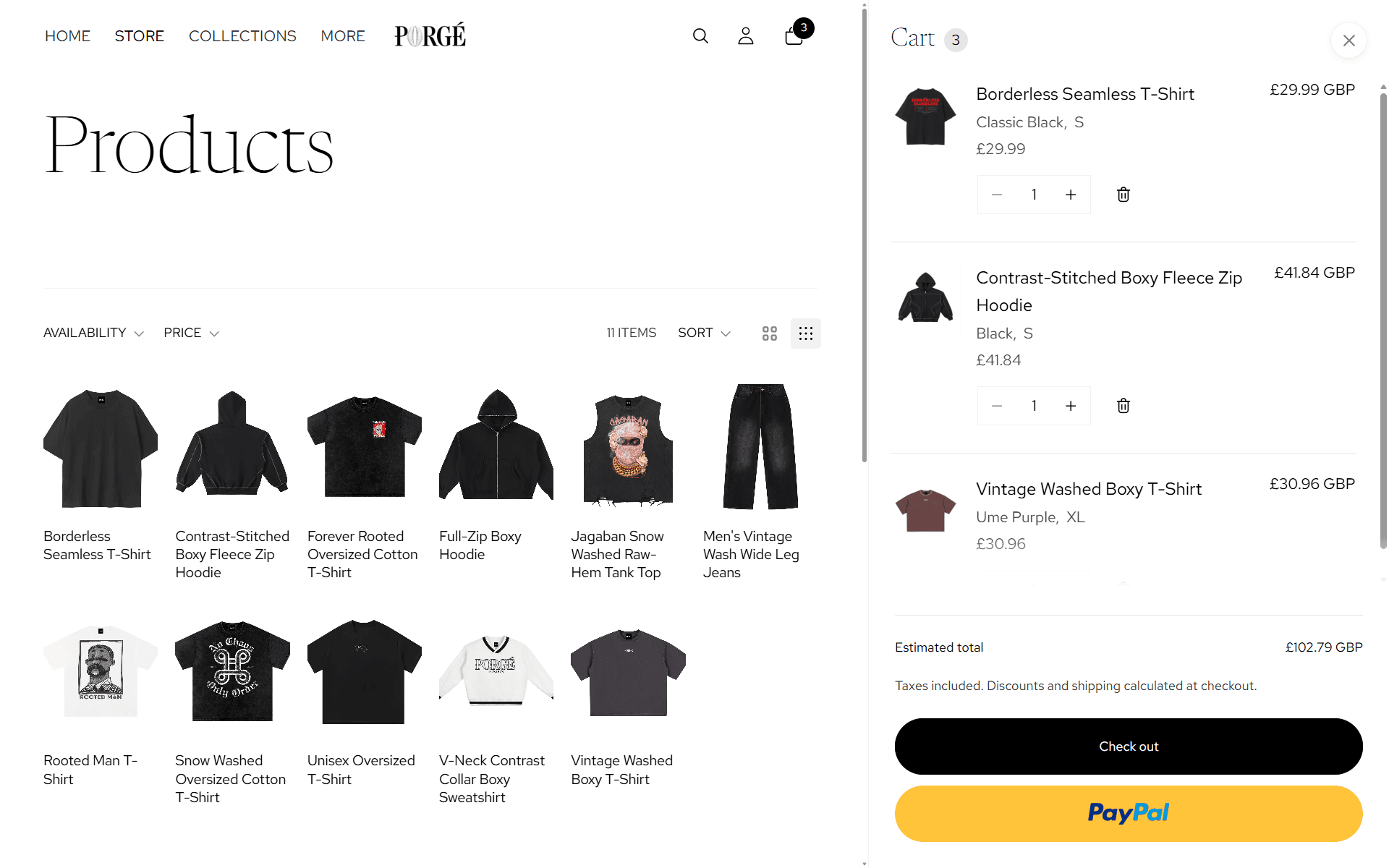
Collections index. Each drop announced, never listed.Product archive. Eleven items, hairline dividers, filters that stay out of the way.Contrast-stitched fleece. The stitching detail is the photography brief.Suggestions. Editorial pairings rather than an algorithmic dump.Checkout path. Square inputs, pill actions. Precision and people.
Pages
The connective tissue: contact, about.
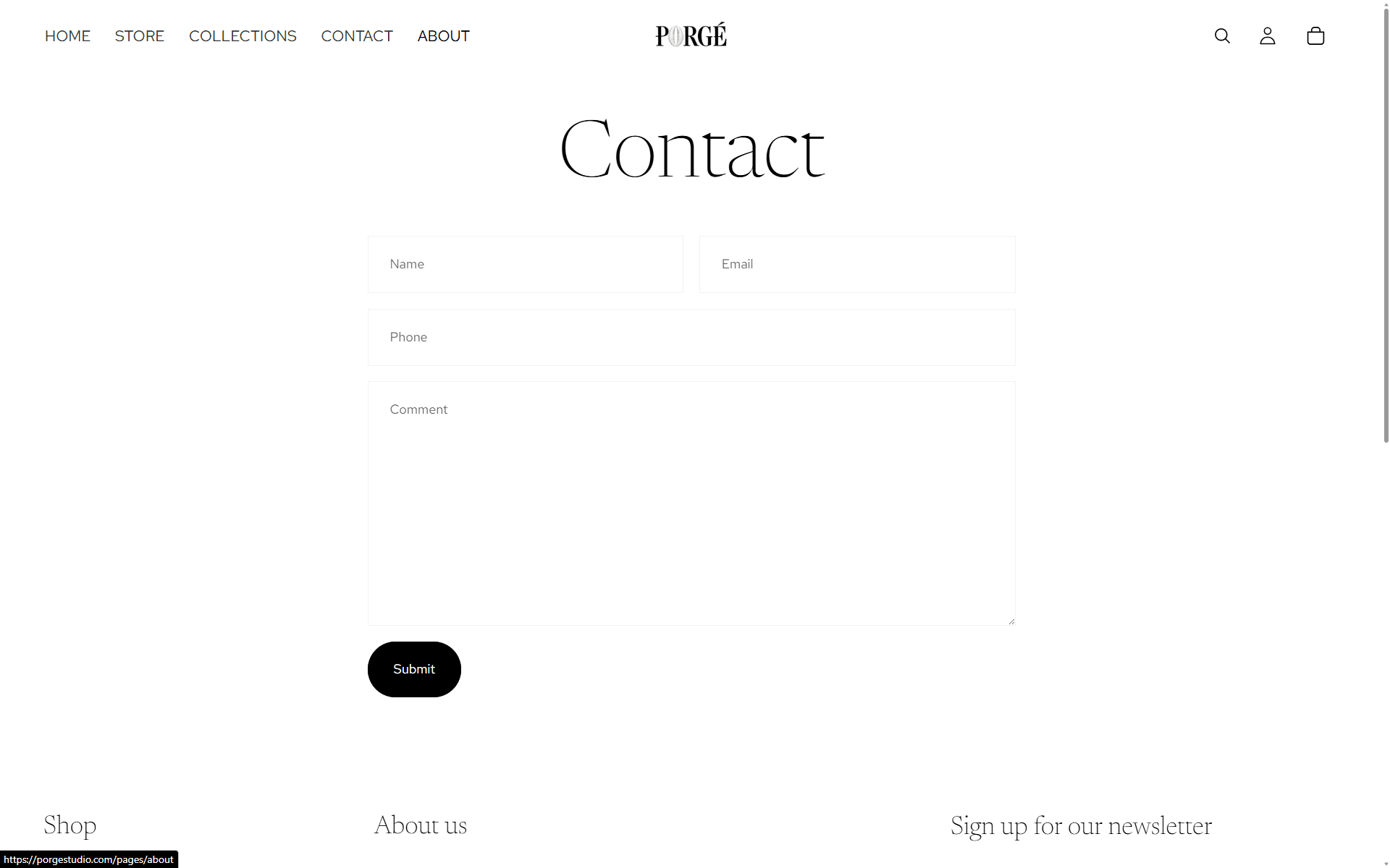
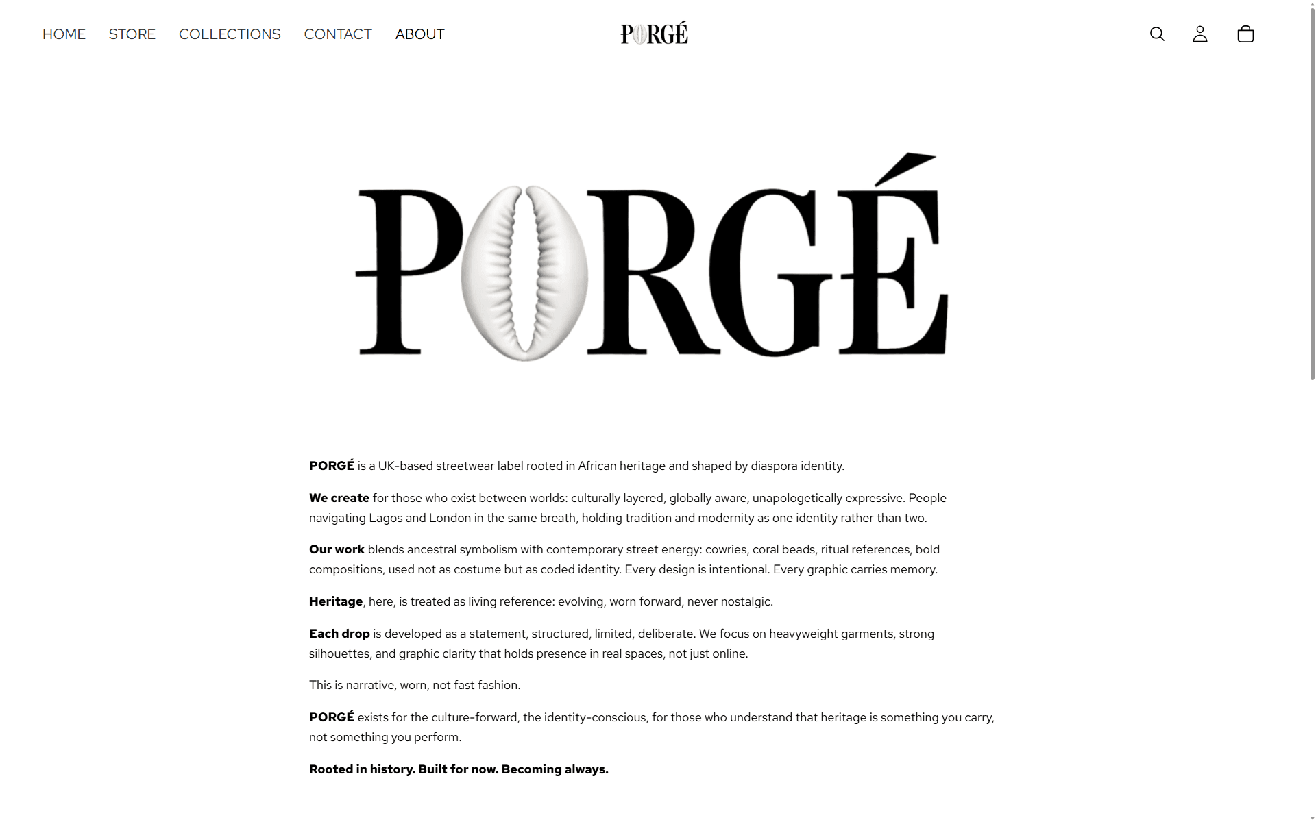
Contact. One form, one address, no theatre.About. The logo, the philosophy, and out. Nobody wants the brand history essay.