A storefront, redesigned
Some sites need a redesign.
This one needed a rescue.
Hired for setup. Stayed for the rebuild.
PORGÉ is a UK streetwear label built on African heritage. Cowries, coral beads, heavyweight fabric. The founder brought me in to rescue a Shopify store that was actively fighting all of that. Bad hierarchy, dead space, imagery that refused to get along. You honestly have to try to make Shopify look that bad.
So alongside the store setup, I rebuilt the front end on the Atelier theme. Then kept going, section by section, until every pixel earned its place.
The store is still private (the founder isn’t ready to lift the curtain), so this page is the tour I can’t link to yet.
- Role
- Design, build, store setup
- Platform
- Shopify, Atelier reworked
- Status
- Private, pre-launch

Two photographs, one seam, one wordmark
No photo deserved center stage. So I used two.
A fashion hero should lead with the logo. Problem: the wordmark needs calm on both sides to sit centered, and every asset we had was too busy for it. Cropped weird, too loud, too literal.
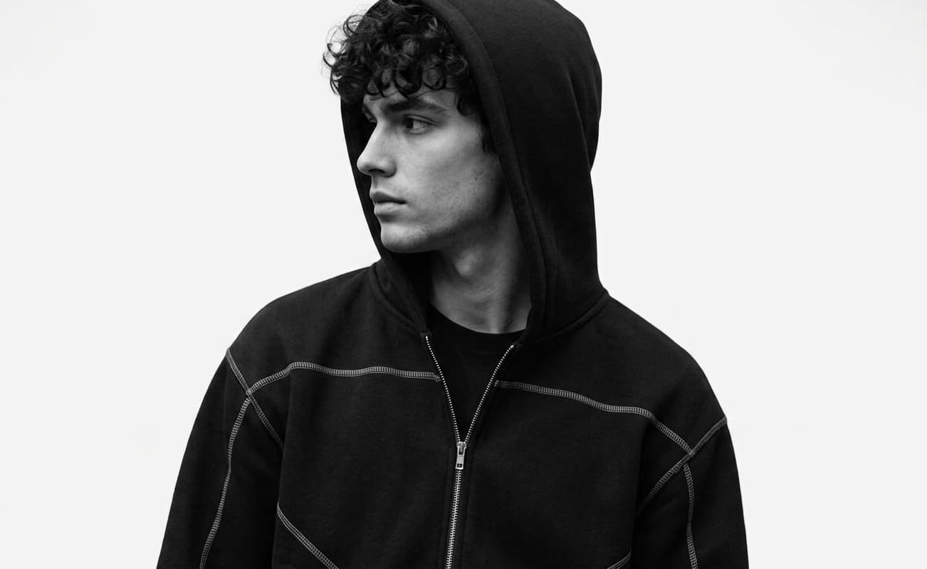
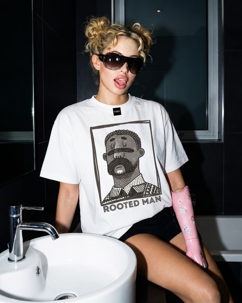
So I stopped hunting and split the hero in two. Hooded portrait left, Rooted Man right, the seam landing dead center under the logo. First render felt like a breath of fresh air. The tension between the photos is what holds the wordmark up.
The nav steps aside too. Links hard left, actions hard right. The split owns the middle.
Right after the loudest section: the quietest.
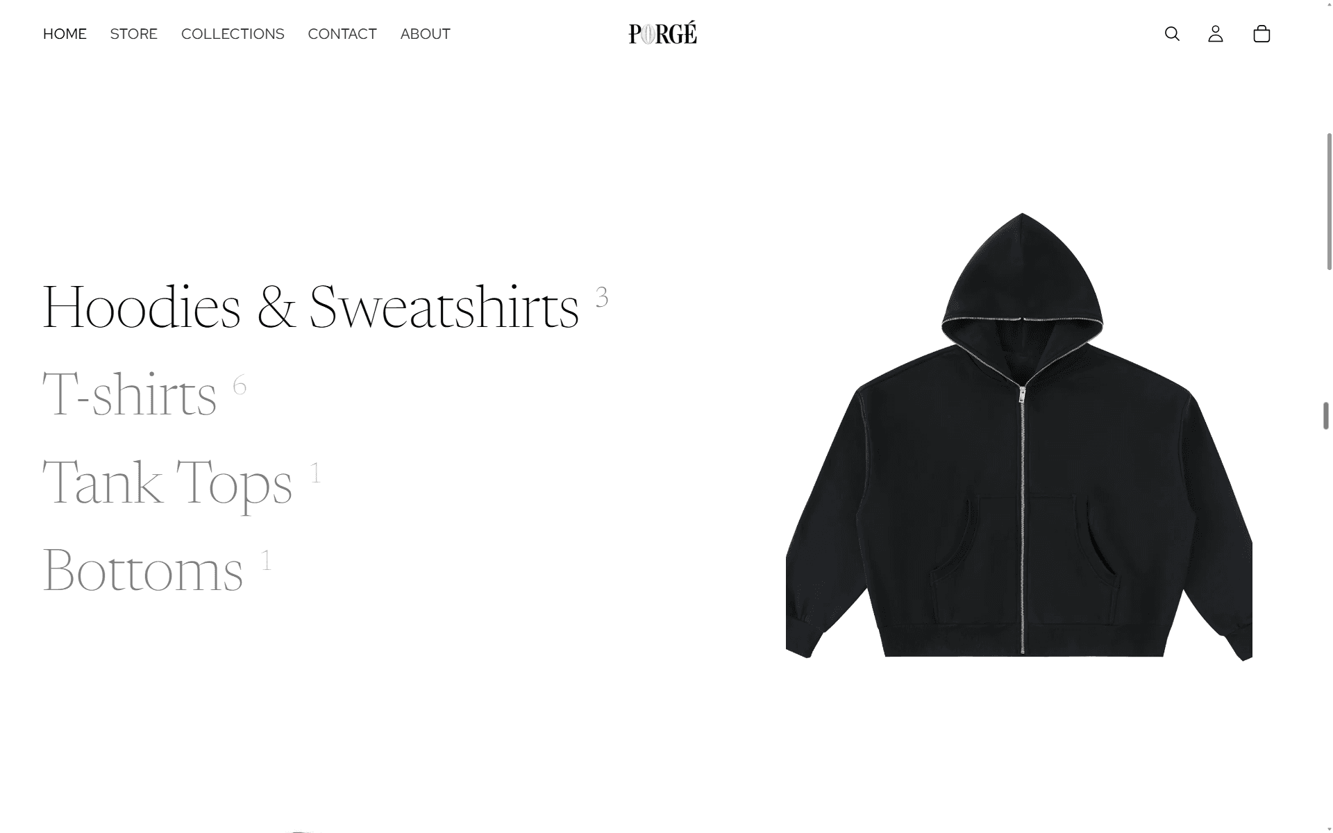
Most stores slam a product grid under the hero. PORGÉ exhales instead. Huge negative space, a serif line, soft hover states, and one product per category picked specifically to pop against the white page.
It reads as confidence. The clothes sell themselves. The page just gets out of the way.
Negative space as a material, not an absence
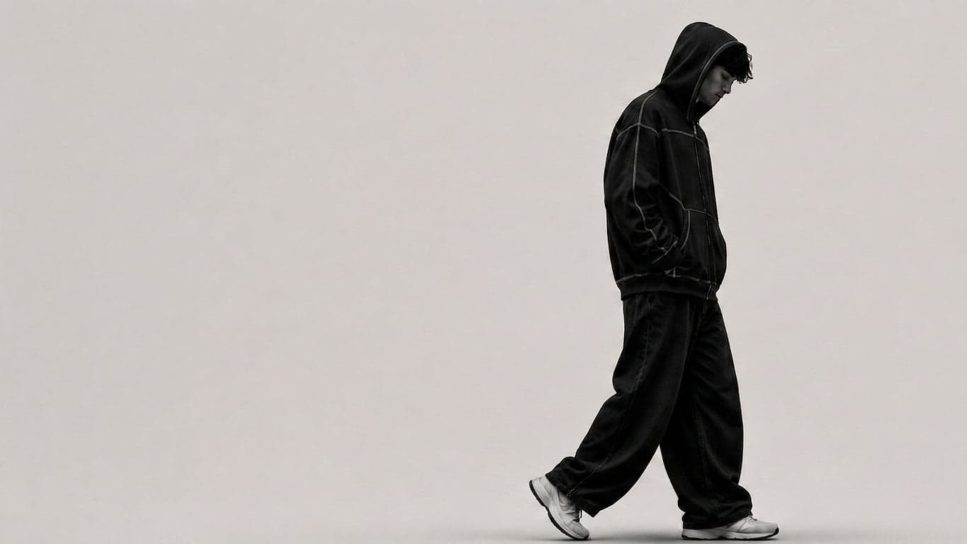
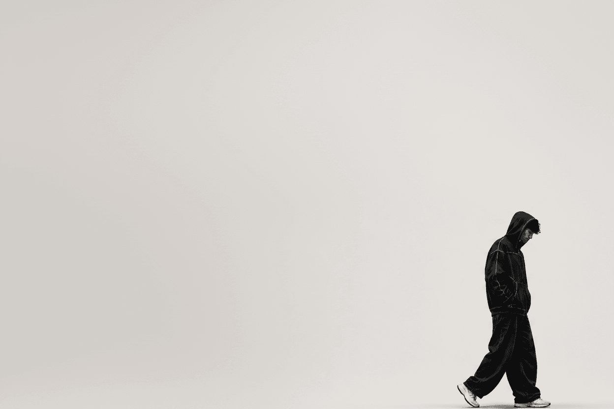
Before, then after. Same photo, opposite energy
My favorite section on the site. Not kidding.
The “Heavyweight fabric” banner went through more iterations than everything else combined. The photo was always right: a guy in black, mid-stride through fog. But centered, it died. Left-aligned, it died.
Then I stopped composing and started directing. Shoved him to the bottom right, mid-stride, and put the Shop link exactly where he’s headed. No underline, no bold, no button. He is the call to action. The copy sits in the space he left behind.
Subtlest CTA I’ve ever shipped. Still my proudest pixel.